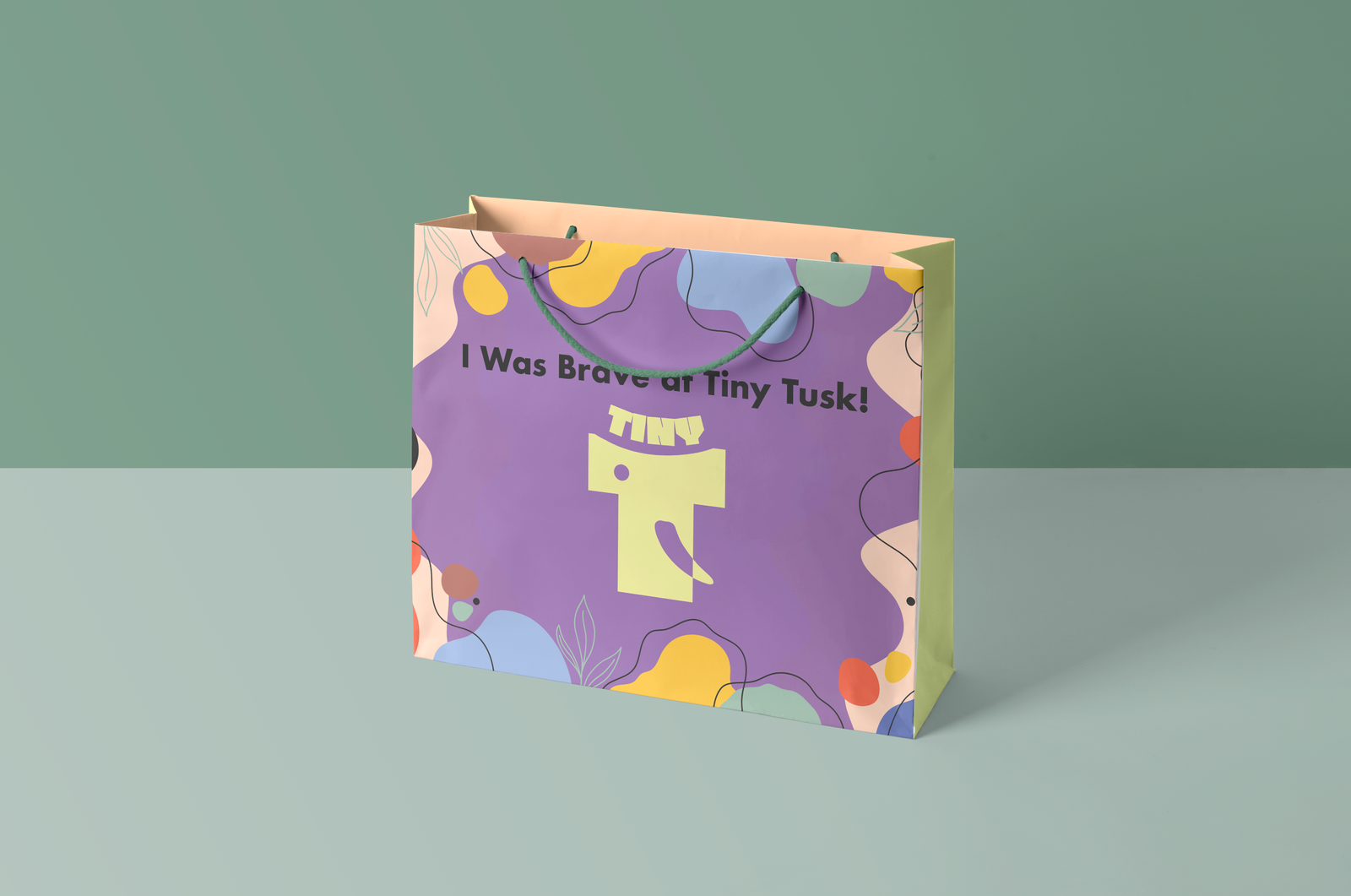
Tiny Tusk Dental Clinic for Kids and Teens

Navi Mumbai, India

Tiny Tusk is a warm, welcoming dental clinic designed especially for kids and teens. With a gentle approach, modern technology, and a playful environment, it makes dental visits comfortable and stress-free. From first checkups to teen dental care, Tiny Tusk focuses on healthy smiles while creating positive experiences for young patients and families.

A title

Image Box text

CHALLENGE

Dental visits are often intimidating for children and teenagers. Clinical environments, unfamiliar instruments, and the fear of procedures make dental care something to be avoided rather than embraced. Tiny Tusk needed a brand identity that could ease this anxiety—one that felt friendly and inviting to kids, while remaining credible and reassuring for parents. The real challenge was to achieve this without falling into predictable visual stereotypes commonly associated with kids’ dental branding.

THE INSIGHT

We consciously moved away from obvious cues—no smiling teeth, no cartoon faces, no literal dental symbols. Instead, we focused on creating a brand that feels playful yet composed, approachable yet thoughtful.

The intent was to design an identity that doesn’t announce itself as a dental clinic for kids, but one that children instinctively feel comfortable with—and parents instinctively trust.

A title

Image Box text

The IDEA

This led to the creation of “Molu”—a distinctive brand icon where the principal alphabet “T” subtly takes the form of a baby elephant, complete with a small tusk. The elephant became a natural metaphor: gentle, friendly, familiar, and non-threatening. It gives the brand a face and personality that goes beyond dentistry, while still remaining relevant. The name Molu is intentionally inspired by molars, anchoring the character to dentistry while allowing it to grow into a recognisable brand persona over time.

HOW VMC DESIGNED A DENTAL BRAND THAT MAKES KIDS FEEL SAFE SMILING WITH.

The logo system is a fusion of typography and iconography—crafted as a single, cohesive unit rather than separate elements. This allows the brand to scale effortlessly across applications while retaining its warmth and character.

Special attention was given to regional adaptations, ensuring the same emotion, balance, and visual rhythm carry through every language version. Each variation feels consistent, considered, and unmistakably Tiny Tusk.

A title

Image Box text

A title

Image Box text

RESULT

Tiny Tusk emerges as a kids’ dental brand with its own voice, personality, and emotional connect—one that replaces fear with familiarity, and hesitation with comfort.

A brand designed not just to be seen, but to be felt.

Need help with your branding? We can help you get there: https://vmcww.com/